you need to put the sword in the slashing frame, it looks bad if you dont.
also, you need to add hands.
you need to put the sword in the slashing frame, it looks bad if you dont.
also, you need to add hands.
OH, thanks. But the pimp’s pimp sleeves dont need hands. But your right about the slashing animation, ill see what i can do. Also, i see that the frigate demo is up!! Will it give me viruses?? My parents are fanatics cuz were ghetto and only have 1 good computer. Ill download it before you answer this though. Yay!!
Also, have Chozo ghost sprites been done?? Im interested in spriting them. And also also, SP commandos are almost done. Just need to make 1 more sprite.
Damn, why did daz get Chozo ghosts??? Anyway, ive decided to wrap up the SP commandoes. Heres the almost complete sprite sheet. I just need to make the jetpack thingy flying sprites. You know, all terrain boosters or whatever. Other than that, it’s complete. Also, i did the awsome pointing sprites “ITS THE HUNTER, SEIZE HER!!!”. Anyway. Now, im not really wrapped up in any projects. Id like to do the parasite queen sprites. Is anyone working on them??
OMG, triple post… anyway, i forgot to add the pic
looking great… remember : it might look better if you had the back leg a little darker then the front one… just a suggestion.
I already did, but do you really think it needs more contrast?? I thought it looked fine, but illl see what i can do to fix it up.
hmm… maybe another forum member will come along and bring some light to the subject?
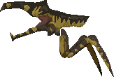
Seeing as how no one has given me their sage advice, ill continue. Since Daz said i wasnt “good”(experienced would have hurt my ego less) enough to help with the P2D project, ive decided its time to quit messing around. I need to start some real projects that wont take 2 days. Heres my newest project, the warrior ing.
Since i havent seen anygood Ing sprites, i decided to take it into my own hands (like i did so long ago with the hunters). I choose ing, because they’ll give me a chance to learn better texturing, and making things look more realistic, and less cartoony. However, ill definetly need help. Since they lack actual details, ill have to learn to make the shading match the curvature of the body more. I thought i had enough shades, but id like to have every opinion.
Purple is a hard color. Try to use some greyish purple to make it feel more realistic. I also think that the darkest shadows should be greenish.
Here is an example how you can make it look pretty real with a few colors.
Look close and see where I put the shadows and the reflections. The reflections should be a bit below the top of the head/back so you give the sprite some volume. You have improved much since you started to post here. You have potential but you also need a litte push in the right direction when it comes to shading.
Keep up the good work!
thats an awsome starship trooper arachnid sprite… is it yours and are you gunna finish it?
Yes indeed, I also watched Starship Troopers, and that looks very accurate.
Man, the first time i watched starship troopers (shudders)…still an awsome movie. But thats an awsome sprite. Ill see how i can apply what you said to it.
Wait a sec. I was wondering. The style of shading ive been doing hasnt really used much texture, and doesnt give the figure enough definition. But heres what ive done so far. I got a little lost when you said the darker shades should be green, but i shaded the collar better to give more volume, but im not sure if im using the write shades.
I also made the shades a little more grey, but im not sure if it’s enough.
…Since i work faster than you people can reply…ILL POST ANOTHER UPDATE.
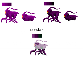
I was bored, and decided to think of the warrior ing as a demonic horse. And, horses hairs make they shiny, so they contrast much more easily than other mammals. Also, horses muscles are huge, so they’re easily defined by the difference in shading. So, i tried to apply that to my ing. It obviosly looks better now, but im not too sure about the shade of green i used. CC plz plz.

It’s much better. I think that you could lighten up the darkest color a bit.
Ah, here. I lightened up the darkest color. Hopefully, it has more dimension now. What about the shade of green i used. Does it look too green, or is it okay? Also, does the shade of purple look real enough??

Id like to make it more textured. advice??
Better. ![]()
The sprite looks better on a darker background. The wite one makes it hard to see all the darker colors.
The easiest way to make textures is to play with the shadows and the reflections a bit. Try to make an illusion of a texture by putting a darker color where the shadow in texture should be…
If you want, I can make an example.
wow. Thats a nice Ing.
That looks very good and fix it up and it look great.
I think i get the basic idea, but im not sure how much more textured i can make it. While waiting for replys, i was wondering how hard it would be to make an akward 5 legged creature run. But im up for the challenge. I did a basic animation of the front leg. It looks bad when you animate it (weird scratch things: probably my gif animator) but this gives a good idea of what im planning. Is this enough frames to create a decent animation. I hope i wont have to do animations for all 5 legs seperately,so id like to know if it can double this as one of the back legs or something. Its not shaded at all, i just wanted to get the motion, and ill adjust the bulk where its needed. But i think it looks a little bad as the leg comes back.

Anyway. While lately ive been doing non fuzion style sprites, i couldnt help feel a little jealous when i saw a weavel sprite sheet in someone elses thread (metroid zapper mabye?). While i had promised to redo weavel anyway, i couldnt find any ingame screenshots. But since this guy was doing in game weavel, i decided to do Nintendo official art weavel again. But i have some questions about the style. Since im making sure i get all round experimentation, im doing outlined sprites. I made this to show the difference between the outlined(weavel body), and unoutlined (represented by my sylux sprites). Which style would you prefer, and which one do you think looks more proffesional?? Also dont mind weavels head, i wasnt sure how to outline it, and didnt want it to look bad without consulting you first.

Hey, dont worry, im not getting off subject. Heres the ing with the darker background. But it bothers me because the dark green looks vulnerable, and clashes with the purple. Should i make it darker, or should i make it a purple?? But also, id like to know where i can add more textures.

The running sprites will take a while, but hopefully, after trial, and error, they’ll look great. Oh, and the name change, i wuz bored.