Wow. Feels like ages since i’ve updated. Naturally, due to the lack of MPH be a decent game, I’ve lost inspiration for finishing up the Kanden sprite sheet. It’s only a couple more stinglarva poses too.
With the Release of Twilight princess, the Garo ninjas just feel outdated, and I’ve also lost inspiration for finishing them.
Soooooooooooooo http://img359.imageshack.us/img359/6802/shadowbeingslq7.png
Shadow beings, from Twilight princess. I’ve always loved creatures of darkness, and I’ve been dying to sprite these bastards. Now that I’ve finished the game, I can catch up on spriting while it’s still fresh. Personally, I really like this sheet. No outlines courtesy of Dazz. The one furthest to the left is the complete one.
edit: just realized how disorganized it is. BTW, i didnt make either of the links. They were for general sprite size referrence.
Lol. My site is pretty much officially on hold as of now. Nobody has been there for quite a while, and I dont feel like reviving it yet. I actually have a different idea for a forum, which I wont allow to die I might add. But running a forum really is hard work. For now, I’ll just post on others.
http://img375.imageshack.us/img375/1163/shadowbeingsjq4.png
Cleaned up the muscles and hips, dulled down the red markings, and changed refference pic (i was orginally using this one, because it’s clearer, but that’s because it’s from a beta of the game). I really need to learn to properly animate, so I’m gonna do a walking animation.
edit:
Head turning done. And it was a bitch. I really need to learn to animate.
2x edit:
Moving animation done…ish. Personally, I think it’s a bit too fluid. Mabye I should remove some frames? Anyway, If the animation is okay, then the whole sprite sheet is complete, which is an assload of spriting stress off my chest, since I’ve been working on this for ages.
CLICK FOR IMAGE WITH TWILIGHT PRINCESS SPOILERS
SPOILER CENSOR from LOZTP(mewtwo, and other right SPOILER CENSOR for refference). Done for the SPOILER CENSOR (because it gives it away) project.
Yeah, the other stuff is pushing it, but that last one is definitely a spoiler. (really obvious, yes, but still a major spoiler). Thus, linkified (no pun intended) and censorified.
Lol. It’s sex on a game system. But abstinence is good, dont forget about STDs.
…If that makes it better.
Yay. Transition frames. Dont mind the dissapearing shield/red arm. I can fixem in a jiffy. Still need to add frames directly after the slash finishes though.
Lol. I was hoping I could get away with the feet. I cut a couple corners making this sprite.
I merely shrunk this picture down to size, and recolored/reshaped it. I must admit that it’s lazy, but I thought the pose was perfect. I’ve already gotten started on an alternate stance though. As far as the skull, I’ll see what I can do.
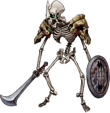
Lol. Movin into my new house, so I havent been able to post anything. The stalfos is done, and I’ll submit it to TSR when I get connection. The earlier times I’ve posted lately have been via Wii internet channel, but since it doesnt ahve a drawing program (which I hope it will get), I cant post or do anything on it. Also, Zant has been severely revamped.
Thats not a stalfos thats a friggin Master Stalfos I know you needs to kill them w/ bombs or bomb arrows. It is really evil but you can kill with bomb arrows, and they just die no matter how much damage they’ve taken.
Thats a runnon sentence just letting you know mkay. Anyhow, It’s a friggin stalfos, and the little ones are mini stalfos. Why call it master stalfos, if the ones from other games (which were the same size) we also called stalfos. Just call the smaller ones something different. Anyhow, the sheet is finished. I’ll get a linky.
They’re called Stalfos in this one. The small ones are Stalkin. Despite the fact that when they originated, the little ones WERE Stalfos, while the bomb ones were Stalfos Knights in one game, Master Stalfos in the next.
And screw bombs. Ball and Chain destroys them in one hit, then breaks their remains in one more.
Zant looks pretty damn awesome, but the shoes are horribly undetailed and unshaded, and seem a little disproportionate. And weren’t his sleeves wider and longer?
The side view helmet is schwing, but the front one seems kinda overly complicated and muddled.
As for Fyrus… a commendable effort, but I don’t think it really worked. It looks more like a fancy Photoshop fire effect than a sprite, regardless of how you made it. It’s a great effect–very firey, and it actually shows muscles despite looking liquid. And the shape is spot on (although the head seems oddly detailed). But something just seems off.
Maybe the unshaded cufflinks are just bothering me cuz they don’t “hold it together” properly…
And for the love of Din, do NOT use that font color on that background color EVER again. I think my eyes are bleeding from trying to read one word. (regarding Stalfos)
Lol. I wasnt expecting fyrus to turn out perfectly, but hell, I’d rather not go back now. I did it in MS paint, but I guess it’s a complinment if it looks like photoshop. Anyhow, I’ll probably just finish up the cufflinks.
Lol. I didnt realize that the stalfos word colors were so bad. Already submitted them, so I might wanna go back and fix it.