make shorter macaroni things bunched up making a line down the back?
But that’s not what it looks like. You can tell that the "macaroni’s are either arranged in a triangle, or a rectangle on the back. It’s difficult to tell because of the angle, so it’s not really worth trying. If they were in a straight line, it would be easy. But i’ll just forget about them, since only the fuzion version has them.
k…just now it looks sorta bare…and who cares what version. this is your sprite.
Bare an acceptable is better than complete but innacurate. I myself thought they looked bad, and i dont have enough reference to make them look good.
Exactly why im not bothering with the macaroni.
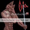
Anyway. New Avatar is almost done, it just needs to have the some of the shading evened out. It’s definetly the highlight of my spriting career, and my favorite work. It’s albatross, dont in a much more realistic style, wielding none other than The Redhalberd. I took some time to make it look more “berdy”.
maybe make the macoroni things shorter?
End of story.
…I never liked macaroni anyway.
Not an update, just need somewhere to put these.
[Edited] Done.
it looks like your avatar is eating its hand =D
you…forgot to take the pallete off man…lol
Wow. I forgot all about the hand. Mabye i should fix that. And i’ll take the palette off while im at it.
edit:
Fixed. Kinda. Dont really care about the hand.
Returning to fuzion style for the remake that you’ve all been waiting for. I intend for it to be the killerap of all my sprite sheets. I present to you.
The kanden remake. It’s also intended to be my entry for a sprite duel…against Frario.
Ahem…Kanden remake. Progress.
Think Frario’s got my ass though. His sylux is pretty badass.
wow thats really amazing.
Needs a MUCH longer neck (from the front) and buffer shoulders (from the side).
That side-facing position looks really crazy and uncomfortable to me, especially the aiming diagonally up one. Seriously, get up and try to stand like that, with the waste sticking as far back as possible and the legs positioned forward, really crouched, and shortened. <_<;;
I love the colors and the style, though.
Yeah, well the forward facing position was designed for the running animation, and since it’s based of Zero missions running (Where samus leans forward), it shouldnt be a problem. The default standing position will look cleaner.
And thanks, this is my best palette ever.
Yeah, i knew about the neck, but just didnt bother changing it. I’ve taken some consideration in the shoulders, but thought it too much hassle to bother changing them. But then again, i’d like to get it right the first time. Sigh*
Progress on running sprites.
Note: at this point, they’re just minor zero mission edits. I’ve gone back in and done some cleaning, but there’s plenty to be reshaded and stuff. Still, criticize please. Hopefully the next update will lack the shoulder/neck issues.
And if someone could animate it for me, that’d be spiffy.
off topic: whats a chocobo?
on topic: NICE!
You’ve gotten way better since you first came here.
lol…samus has a kanden suit.
Giant yellow birds from the final fantasy series. I dont know much more than that.
Practice, devotion, and too much spare time can be blamed for that.
The running poses are ZM recolors. I used Mass recolor techniques, and then edited from there. I just forgot to remove that sprite. : p