Actually, my problem isnt the purple pink. But the program i used to use for rotation made the sprite all grainy, and pretty much did what JPEGs do. I just need it rotated so that the colors dont mix or watever, then ill fix it.
Thanks to butch, i was able to complete the weavel sprite sheet.
Here it is.
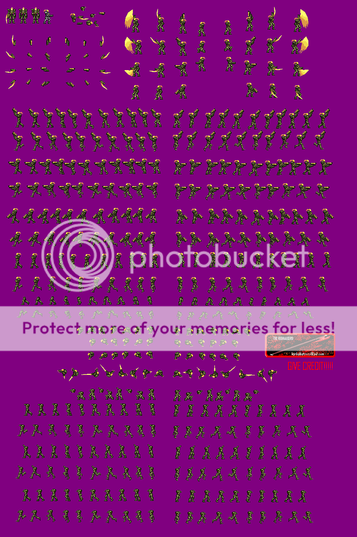
Now i finally have it off my hands, so i can start working on newer projects. I could have made it better, but i was getting sick of it. Anyhow, Thanks to everyone here for their support and criticism, i couldnt have done it without you.
those look really sweet. so i take it u dont need help with the rotating now?
Nope, someone already did it for me. Now, if i have any goddam spare time (first day of school was today), ill finish the chozo.
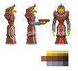
Here we are. Since ive finally tied up most of my loose ends, i decided to work on albatross some more. Here’s the reshade. It’s clearly alot better, but you should zoom in just to see how much ive improved.
BTW, isnt the graphics board kinda overflowing with stray topics lately??
i dont need to zoom in! my eyes have the power to see pixles! oh ya… im great arent i?
btw, those look so sexay compared to your other alb. i see some use of dithering too, which is good. keep up the excellent work ![]()
Ummm… i dont think i used any dithering or anti aliasing. Eh, mabye i did. Anyway, im doing a front pose at the moment. Ill update as soon as it’s done.
<IMG SRC=“http://www.orlyowl.com/pokerly.jpg”>
oh… oops… maybe my power is waning.
My sprites drain power from all!!!
u gunna post some more crap… uhh i mean… sprites soon?
jk =)
WTF??? My crap is a whole lot nicer than your SPAM.
XD!! Srry.
Anyhow, i promised id make albatross more interesting, so i gave him som guantalet and leg brace thingys, and put crystals in his chest, shoulders, and knees. Tell me what you think.
Much much better. There is just one thing that feels wrong. His left arm looks too long.
Ahhh, i think i see it now. I’ll fixit up in a jiffy.
Meh, this whole “Is Jesus real” topic has been interrupting my spriting. Anyhow, i finished the chozo.
I’d like to do come chozo ghosts later, but at the moment, i think i’ll work on Albatross.
double[Edit]
I did some anti aliasing on the pirate.
OMFG, its been like a week. BUMP!!!
I was away for most of your work here so pardon my late response.
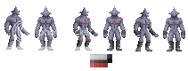
1–The Weavel, despite being wrongly colored, is FUCKING AWESOME. Although, the side view shoulder pad shading could use work.
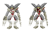
2–The chozo looks really weirdly shaded, blurry, and un-chozo-like.
3–The pirate needs more contrast.
Hmm, didnt see that coming. Ill see what i can do for the pirate. But the chozo, unchozolike, yes, but im not sure i understand the shading problem. Mabye i should have kept the outline.
What did you think of the Albatross reshade??
EDIT:
Chozo ghost. That’s what i have so far. I feel i did the shading badly, but i was trying to give him the spectral glow. Naturally, i based it off of the official art.
if you want to give it a spectral glow, invert the colors on some normal sprites, take a look at that, then try shading it with the colors you want, but remembering to make the outline look bright instead of dark.
take a look at how cool these samus’s are!
of course, its just a suggestion, so you dont have to listen to me.
Those do not look ‘cool’ at all. The shading is backwards and the outlines are horribly fucked. I know you were advocating only using the colors, but even then, very rarely will you actually get the shades you want. >_>
And halberd, the ghost looks pretty cool so far. You oughta try to make accurate versions of your ghost and pirate some time though, instead of just concept art ones. =D
One thing I gotta say though, for a ghost, it sure has a hard outline. If you want it to look soft and etherial, make the outline much lower contrast to the shading.
the example was to make the outlines bright and to make the inside dark. it doesnt look good right now, but if he maunally shaded it, and had the blue shades he chose inverted (basically so the brightest blue is the outline, while the darkest blue is the highlights)
and, if you like the idea, just be sure to make a version of what i explained, and, just to have a backup incase u dont like it, the original version.
EDIT
heres what i mean. see the angelic, ghostly feel?