It’s just an even red-yellow gradient.
Oh, also, I love your av. I forgot to tell you <3
Well, what I mean by the “refining” is that the outlining gets thinner, while the gradient gets smoother.
Also, as hard to believe as it may be, I made that avatar in MSPaint.
Oh, yeah.
Also, that’s awesome, except the spraypaint tool is a huge NO. You can see it from a mile away, and it’s bleh.
Yeah, I thought it was fairly obvious, but that was the first way I could think of to make a “wrinkle” effect. I’m pretty sure I saved the lettering separate from the gradient, so I’ll see what I can do.
That’s pretty good for MSPaint
What’s that supposed to mean? Most of P2D’s resources were done in Paint too. Paint is not a handicap.
Paint gives you much more freedom than Photoshop, contrary to popular belief.
In Photoshop, you’re obliged to look like you used a bunch of different brushes and effects and stuff.
In Paint, no one’s asking you to use anything but the pencil and the color editor. I feel much more at home there. ![]()
Amen. Also, I’ve found that recoloring is much easier in MSPaint than anything else, as are mathematical comparisons.
And Paint doesn’t let you crutch yourself with filters.
I do prefer PS due to its tool hotkeys, though.
Okay, redo with less obvious effects on letters:
Only thing I’m obliged to is making it look awesomeness.
You’re good at photoshop, though. >_>
The only thing you’ve ever done with paint is making your swords (unless you did even that in photoshop). Try making something more complex, or something that isn’t just an outline + color, and generally expand your Paint horizons. You’ll feel it too.
Paint is OK, but I work with graphics, not spiriting, so…
I REALIZE THAT BUT WHAT TECHNIQUES!?!? -.-
Well, you create a document and use tools to create an image. >_>
Seriously, though, just look up some tutorials or something.
I can’t decide whether to use this or my current av… I think I like the Crocomire one a bit better, but it’s just a scan whereas I made this one from scratch, plus it has a pirate. >_> Also, should it be shaded, or should it stay bright and cartoony like that?
Hm…I like the current av, Daz. But if you were to switch, I would keep the cartoony style. The only thing I would change is instead of “Can I has cookie?” I would make it “I can has cookie?” Considering he’s already holding the cookie. Plus it could be a spin-off of all those cat pics that were so blatantly photoshopped.
Darn limits, this would have been a good avatar.
If you could make it smaller…
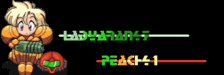
First attemt at this border type.
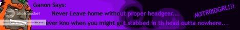
-sigh- i just recently got into making sigs… well… not that recently but yeh… some of them look good and some of them just look like crap… besides i only made like 5 anyway (th trial version to photoshop ran out @_@) ![]() my whole point in making this… post… was to sho off my not so mad skills of sigs… hopefully i can cheat my way around into getting photoshop for free… ehh… but thats for another day
my whole point in making this… post… was to sho off my not so mad skills of sigs… hopefully i can cheat my way around into getting photoshop for free… ehh… but thats for another day ![]() ok i guess i should stop talking and sho u then right?
ok i guess i should stop talking and sho u then right?